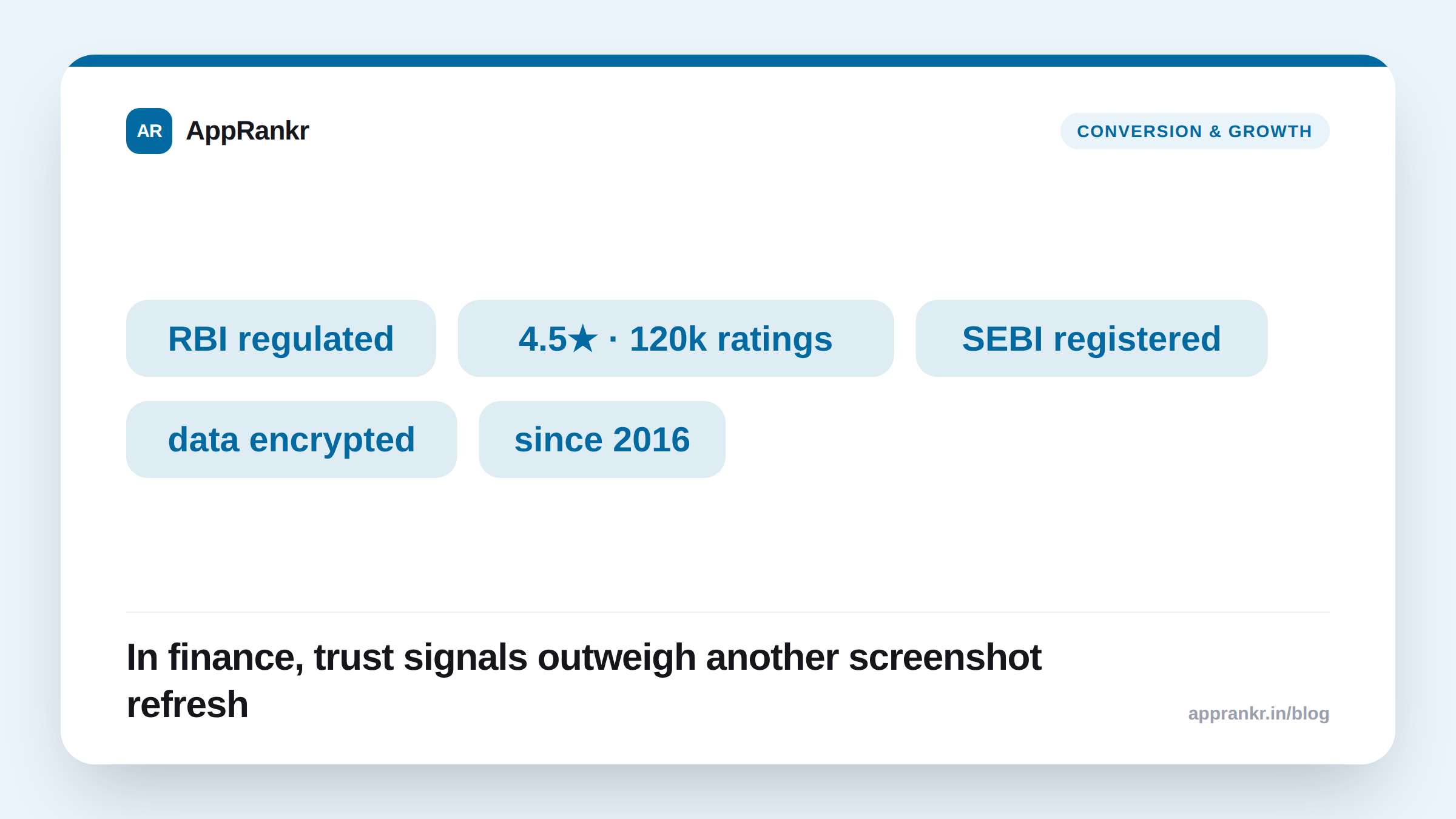
A game’s store listing has to answer “does this look fun.” A fintech app’s listing has to answer a much harder question first: “can I trust this with my money and my data.” Skip that question and a beautifully designed screenshot carousel showing clean UI screens won’t convert nearly as well as a plainer listing that answers the trust question directly. Because the anxiety being resolved isn’t aesthetic, it’s financial.
What actually functions as a trust signal in a store listing
| Signal | Where it shows up | Why it matters more here than in most categories |
|---|---|---|
| Regulatory registration / license mention | Description, sometimes subtitle | Directly answers “is this a real, accountable entity” before anything else does |
| Security/certification badges | Screenshots, description | Addresses the specific fear of financial data exposure, not general app quality |
| Real user counts / AUM / transaction volume | Screenshots, description | Social proof calibrated to scale. “X users trust us with Y” is a different claim than a star rating alone |
| Transparent fee disclosure | Description | Removes the single most common hesitation in finance-app conversion: hidden cost anxiety |
| Press/media mentions | Screenshots, description | Third-party validation reads as more credible than self-description in a category where self-description is expected to be skeptically read |
None of these are unique to fintech in concept, plenty of categories use social proof and badges. What’s different is the weighting: for a photo-editing app, a UI tour genuinely is the main conversion lever, because the core question is “does this do what I want, and does it look good doing it.” For a finance app, that question is secondary to “should I trust this at all”, and a listing that leads with UI polish before addressing trust is answering the wrong question first.
The compliance tension unique to this category
Both stores apply real extra scrutiny to financial-services listings, specifically because a misleading claim here carries actual financial risk to a user in a way a misleading claim in a game does not. Language implying guaranteed returns, understated fees, or an unverifiable regulatory claim is a well-documented rejection trigger. This creates a genuine tradeoff a game or utility app never has to navigate: a keyword or phrase that would plausibly rank well can simultaneously be a compliance risk not worth taking. This isn’t a legal-advice point (check specific wording with your own compliance team) but it’s a real, category-specific constraint on ASO copywriting that has to be designed around, not discovered after a rejection.
Real-world scenario: A lending app A/B tested two screenshot sets on the same underlying listing. Set A led with three UI-tour screens showing the clean application flow, followed by a fourth screenshot mentioning regulatory registration in small text. Set B led with the regulatory badge and a user-count stat in the first screenshot, with the UI tour moved to screenshots two and three. Set B converted meaningfully better despite being, by conventional design standards, the “less polished” opening screenshot, because it answered the trust question the viewer actually had before asking them to evaluate the interface at all.
Reviews read differently here too
Negative reviews on a finance app skew toward a different texture of complaint than most categories (fund-transfer delays, KYC/verification friction, support responsiveness on time-sensitive issues) and these complaints carry more urgency in a reader’s mind than “this game is buggy,” because the stakes feel higher. Watching rating velocity specifically (not just the all-time average) matters even more here than in a typical app, since a cluster of trust-related complaints can compound into hesitation for every subsequent viewer of the listing, not just lost stars.
What to actually do
- Lead your screenshot set with a trust signal, not a UI tour: an ASO audit can flag whether your current listing opens with reassurance or jumps straight into a feature walkthrough.
- Keep compliance-safe phrasing in mind at the keyword-research stage, not after a rejection: a term that would rank well but implies a guaranteed outcome usually isn’t worth the policy risk in this category specifically.
- Watch rating velocity and recent 1-2★ share closely (see our piece on how negative reviews affect rank) since trust-category complaints compound reader hesitation faster than an average bug report does.
- Track the other apps actually in your fintech sub-category shelf (tracked deliberately, not just algorithmically discovered) since “who else is on this shelf” carries more weight when the trust bar is already high for everyone in it.
The UI still has to be good. This isn’t an argument against design quality. It’s that in a category where the first question a viewer asks is about trust, not aesthetics, a listing that answers that question first will out-convert one that makes them wait for it.