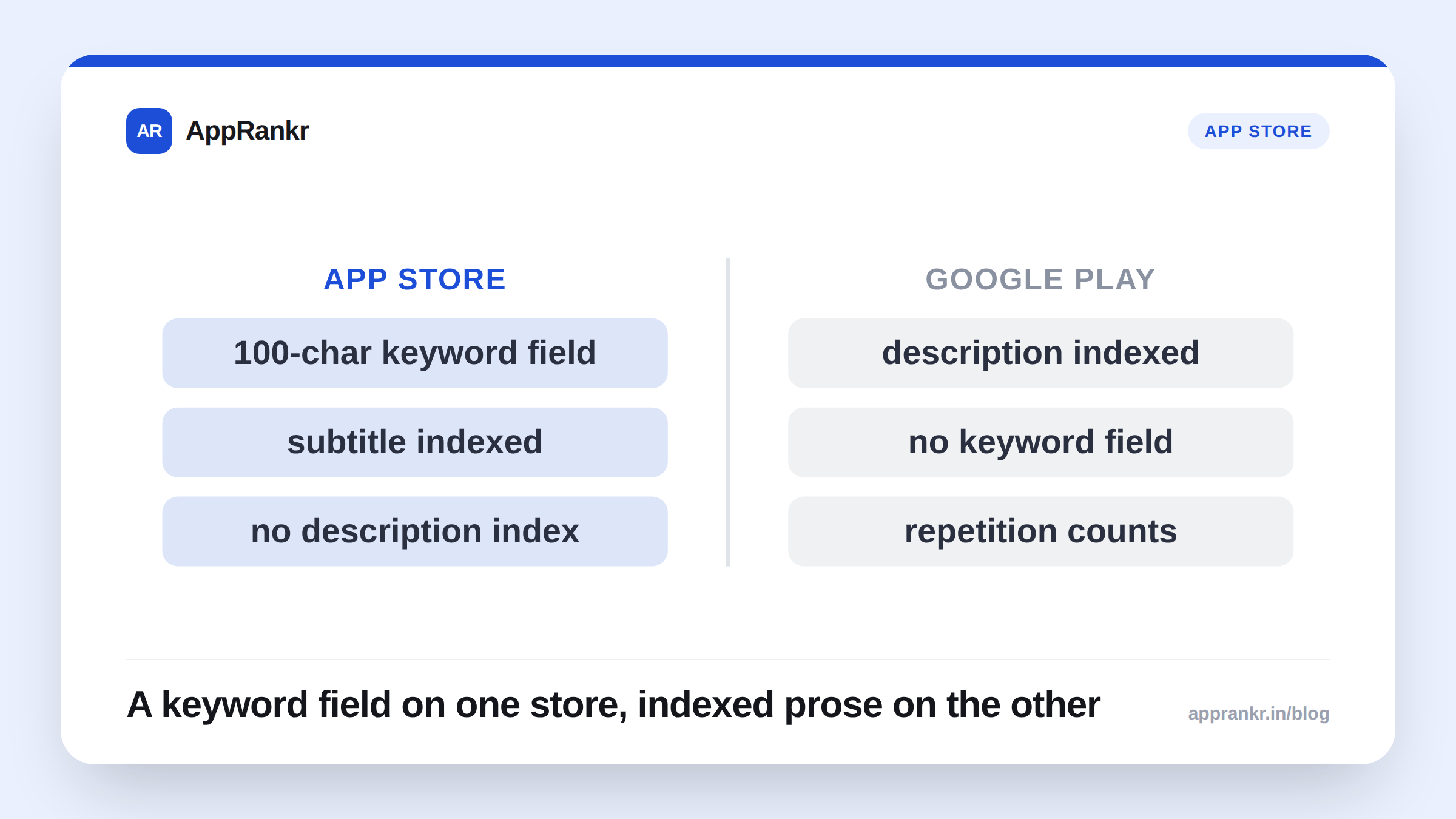
Teams that ship on both platforms often reuse the same listing strategy for both, assuming “ASO is ASO.” It mostly isn’t, the two stores index different fields, weight them differently, and even define “search” differently under the hood. Copy-pasting a strategy across platforms leaves real ranking on the table on at least one of them.
| iOS (App Store) | Android (Google Play) | |
|---|---|---|
| App name / title | 30 characters | 30 characters (recommended; field allows more) |
| Subtitle / short description | 30 characters | 80 characters |
| Hidden keyword field | Yes, 100 characters, never shown to users | No equivalent. All keywords must be in visible text |
| Update review lag | Hours to a couple of days (human/automated review) | Typically live within hours, no review gate |
| Screenshot policy | Stricter, no fake UI, third-party logos enforced | More permissive layout and promotional overlays |
| Discovery surfaces | Search + Today tab / category browse | Search + Top Charts / category browse |
The single biggest structural difference: the hidden keyword field
Apple gives you a 100-character keyword field that is never shown to users but is indexed for search. This is the most consequential difference in the entire iOS vs Android comparison. It means on iOS, you can target keywords you’d never want visible in your public listing (too clinical, a competitor’s brand-adjacent term, a common misspelling) without cluttering your actual title or description.
Android has no equivalent. Every keyword you want Google Play to index has to live in visible text, your title, short description, or long description. There’s nowhere to “hide” keyword targeting on Android; your keyword strategy and your public-facing copy are the same document.
Practical consequence: an iOS strategy that leans on the keyword field to pack in 15-20 secondary terms simply has no equivalent move on Android. On Android, you have to be far more selective and deliberate about which terms make it into visible copy, because you’re paying an attention cost (to human readers) for every keyword you target, not just a text-length cost.
Title length and what it means for strategy
Apple’s app name field is short (30 characters) and Google’s is longer (30 characters is Google’s recommended limit shown prominently in search, though the technical field allows more). Both stores recommend keeping the title focused, but the subtitle/short-description field is where the real divergence shows up:
- iOS subtitle: 30 characters, indexed, shown directly under the title in search results.
- Android short description: up to 80 characters, indexed, shown in the Play Store’s expandable listing but with less prominence in search result cards than iOS’s subtitle gets.
Because Android’s short description has roughly 2.5x the character budget, there’s more room to work in a secondary keyword phrase naturally, in a way that still reads well to a human, where iOS’s tighter subtitle often forces a choice between one clean phrase or a keyword-dense fragment that reads awkwardly.
Update cadence and re-review
Apple’s app review process (a human or automated review gate before any update goes live) means iOS updates have a lag (often hours to a couple of days) between submitting and the update (and any listing changes bundled with it) actually going live. Google Play’s rollout is typically much faster, often live within a couple of hours, with no equivalent human review gate for standard updates.
This changes how you should think about testing ASO changes. On Android, you can iterate on title/description changes fairly quickly and observe rank movement within days. On iOS, the review lag means your test-and-observe cycle is inherently slower, plan iOS listing experiments with longer windows between changes, or you’ll end up attributing rank movement to the wrong change because two edits landed close together.
Screenshots, video, and the conversion side
Both platforms support screenshots and preview video, but:
- Apple supports separate screenshot sets per device size/orientation and has historically been stricter about screenshot content policy (no obviously fake UI, no third-party logos without permission enforced more aggressively).
- Google Play gives more layout flexibility in the store listing (feature graphic, promo video via YouTube link, more freedom in how screenshots are captioned) and has generally been more permissive about promotional overlays on screenshots.
Neither difference is a ranking factor directly (these are conversion levers) but they mean a screenshot set designed for Android’s looser rules may need actual rework for iOS’s stricter ones, not just a resize.
Real-world scenario: A habit-tracker app built one screenshot set with bold “4.9★ Rated!” text overlays and a fake notification-banner mockup, designed for Android. Reused as-is on iOS, two of the five screenshots were rejected in review for the mocked-up notification banner, costing a week of back-and-forth that platform-aware screenshot planning would have avoided entirely.
Category and browse behavior
Google Play’s browse/category surfaces (Top Charts, category-specific charts) have historically been a larger share of overall app discovery than the App Store’s equivalent surfaces, though both platforms have shifted more discovery toward search over time as their catalogs have grown. Practically: if your category chart position matters to your traffic, that’s worth monitoring on both platforms, but don’t assume the two “Top Charts” behave identically or carry equal discovery weight. Track them separately, because a category-chart win on one platform doesn’t imply the same traffic impact on the other.
The one thing that’s the same everywhere
Despite all of the above, the core relevance principle holds on both platforms: your visible copy needs to genuinely agree with your keyword targets, and quality signals (ratings, crash rate, retention) suppress or boost ranking on both stores. The mechanics of where you can target a keyword differ; the underlying idea that keyword relevance plus app quality drives ranking is consistent across both.
If you only have the resources to run one unified strategy, build it around that shared principle, then layer the platform-specific tactics above (the hidden keyword field on iOS, the longer short-description budget on Android) as refinements, not the foundation. Tracking both platforms side by side is the only way to know whether a change on one is actually moving the needle differently than on the other.