The icon is the one listing element a shopper sees before they’ve read a single word you wrote. It shows in search results, category browse, and the home screen after install, always at a small size, always next to competitors’ icons doing the same job. If it doesn’t earn a tap, nothing else in your optimized listing gets a chance to work on that person at all. That’s the case for testing it first, and for testing it properly.
What actually moves the needle in an icon
Most icon tests fail not because icons don’t matter, but because the variant changes too many things at once to tell you why it won or lost. Isolate one of these per test:
| Variable | What it tests | Example |
|---|---|---|
| Contrast against search results | Whether the icon stands out in a crowded grid of competitors | Bold flat color vs. muted gradient |
| Character/mascot vs. abstract mark | Whether a recognizable figure outperforms a clean symbol | A mascot face vs. a geometric logomark |
| Clutter | Whether a badge, ribbon, or secondary graphic helps or just adds noise at small size | Icon with a “NEW” badge vs. clean icon |
| Color family | Whether a different dominant color reads better in-category | Blue (common in finance) vs. a less-crowded color in that category |
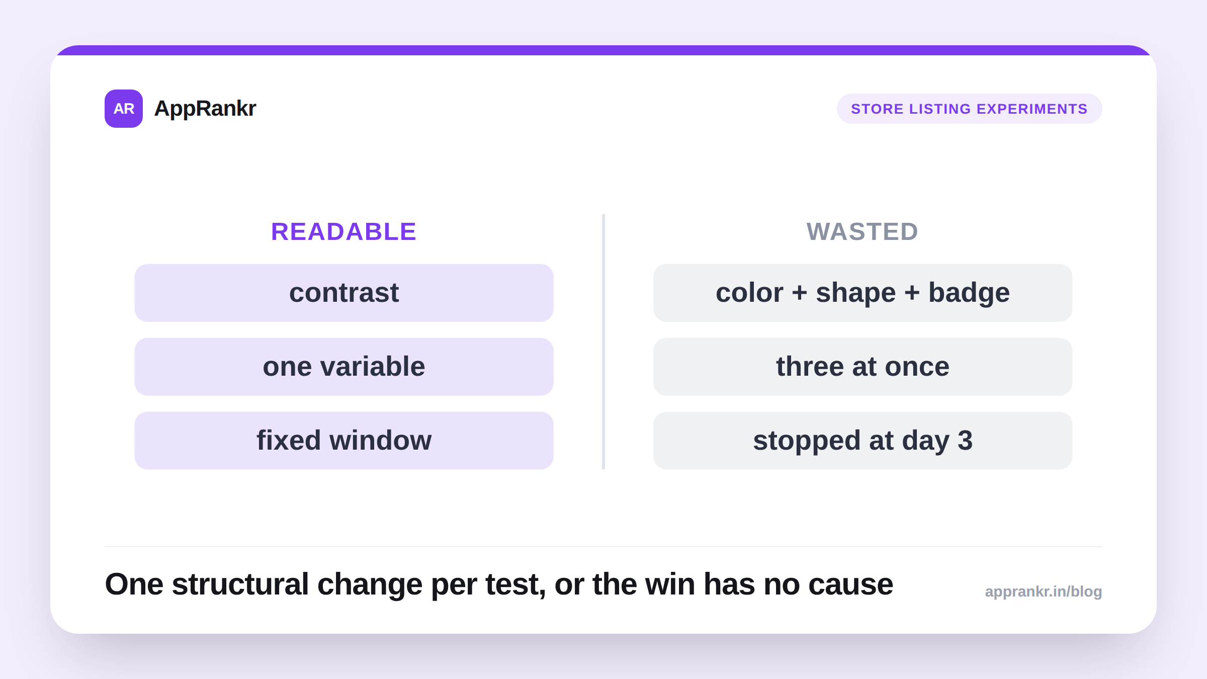
Pick one row, not a redesign that touches three of them simultaneously. A combined variant that wins tells you the new icon is better, not which change made it better, and you can’t carry an unattributed win into the next redesign.
Setting it up so the result is readable
- Start from a real hypothesis. “Our icon uses the same blue as four competitors in this category’s search results, so it doesn’t stand out” is testable. “Let’s try something fresher” isn’t, because you won’t know what to conclude from either outcome.
- Keep everything else in the listing fixed. If you’re also mid-way through changing screenshots, the icon test’s result gets contaminated by a variable you didn’t isolate.
- Let it run a full week minimum, so weekday/weekend traffic differences wash out across variants, and long enough for Play Console or App Store Connect to report a confidence level it’s willing to stand behind. Icon tests behave the same as any other store listing experiment here, nothing icon-specific changes the math.
- Judge it on tap-through / store listing conversion rate, decided before the test starts. Deciding the success metric after seeing early results is how a team talks itself into whichever number looks good.
Real-world scenario: A budgeting app’s icon used a muted navy that matched three of its top five competitors in Play Store search results. The team tested a high-contrast orange version against it, one variable, color and contrast, nothing else touched. By day 5 the orange variant was already showing a lift; by day 13, with enough visitors accumulated, it had settled at a confirmed +6% tap-through improvement. Because color/contrast was the only thing that changed, the team knew exactly what to carry into their next market’s icon design, not just that “the new one was better.”
What not to do
- Don’t test icon and screenshots in the same experiment window unless your platform explicitly supports a multivariate test with enough traffic to separate the two effects. Most apps don’t have that traffic volume, and a false confident read is worse than a slower true one.
- Don’t stop at a 3-day lead. Early leads in listing experiments regularly reverse or shrink once more data accumulates, the same pattern that shows up in store listing experiments generally.
- Don’t treat a winning icon as permanent. Competitor icons in your category shift over time, what stood out a year ago may now blend into a category that’s converged on the same palette. Re-test periodically, not just once at launch.
Once you have a confirmed winner, log the change date as an annotation against your rank and visibility trend, a rank tracker that lets you mark listing changes turns “did the new icon actually help beyond conversion” into a lookup instead of a guess the next time something moves.